DepEd
Analytics.
Education Infrastructure Dashboard
The Overview
Public education data is often siloed, making it difficult for stakeholders to visualize the distribution of resources across the Philippines.
I developed this interactive **Power BI Dashboard** to analyze the landscape of over **37,000 schools** for the 2020-2021 school year. The goal was to provide a clear, high-level view of school density, geographical distribution, and sector classification (Public vs. Private) to support data-driven decision-making.
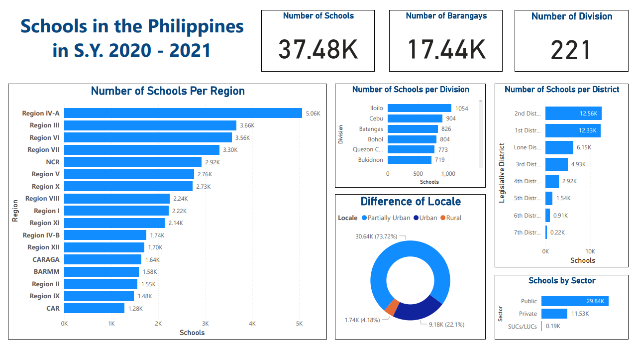
Interactive visualization of 37.48K schools across 221 divisions
Key Insights Uncovered
By transforming raw datasets into visual KPIs, several patterns emerged:
- Regional Density:Region IV-A (CALABARZON) has the highest concentration of schools (5.06K), significantly outpacing the National Capital Region (2.92K).
- Urban vs. Rural:Over 73% of schools are located in "Partially Urban" areas, highlighting the need for hybrid infrastructure support outside major cities.
- Public Sector Dominance:Public schools (29.84K) outnumber private institutions (11.53K) by a ratio of nearly 3:1.
Tech Stack
- Microsoft Power BI
- Microsoft Excel (Data Cleaning)
- Data Modeling
- Geospatial Analysis
My Process
- Data CleaningStandardized naming conventions for 221 divisions.
- VisualizationBuilt drill-down capabilities from Region to District level.
- AnalysisIdentified gaps in urban vs. rural school distribution.
Case Study: DepEd Analytics